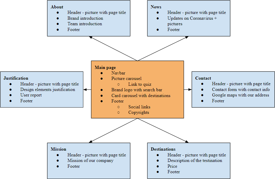
Flow diagram
For our pages we have added an About page to inform visitors of our brand and of the team behind this brand. We have our team’s pictures on this page with roles we would take if this was an actual company. The News page was chosen due to the current pandemic. As we are a travel agency, we thought it is important to notify customers, we are currently not sending anyone on vacations. In the Mission section we specify our mission with this company. The Destinations pages are 6 separate pages for each destination. We will present the destination, show pictures of the destination and inform customers of the price of the trip. In the Contact page we have a contact form, as well as google maps with our address and links to our social media.
Wireframes
*left image is a wireframe of the home page, right image is contact page
*colors in the wireframes do not correspond with the actual website
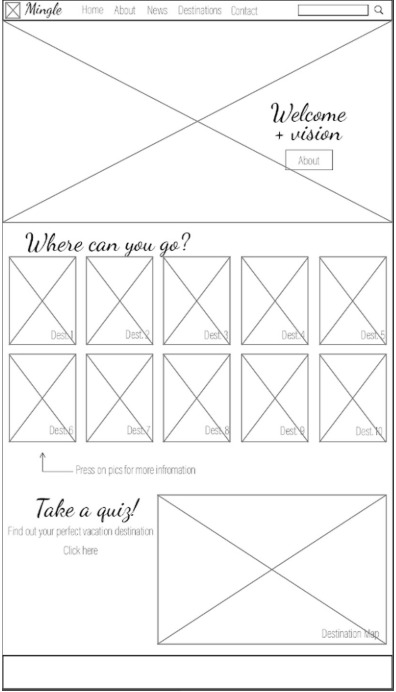
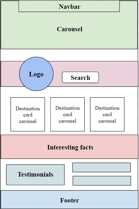
In the Homepage we start with a navbar with our name in the middle. Underneath we have a carousel of travel pictures to get people excited about traveling. Overlaying the carousel is a button to our quizz that visitors can take that we use to match couples for their trips. Below we have our company logo with a search bar. Underneath we have a card carousel of the destinations to show a little snippet of all the places people can travel to with our agency. Below we have an interesting fact of the day. We added some testimonials of satisfied customers. At the bottom we have a footer with copyrights and social media links.
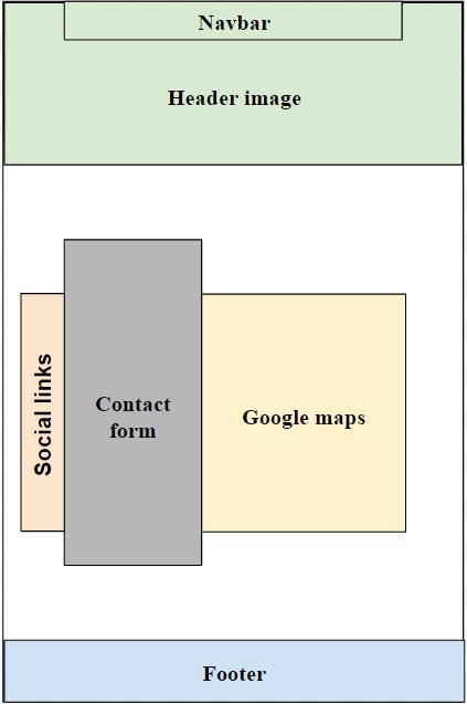
In the Contact page we created a contact form with our contact information on top. We also added social links on the left side, if someone wants to contact us there instead of an email. Lastly, we put google maps with our address pinned, so people can find us on maps. At the bottom we have a footer.
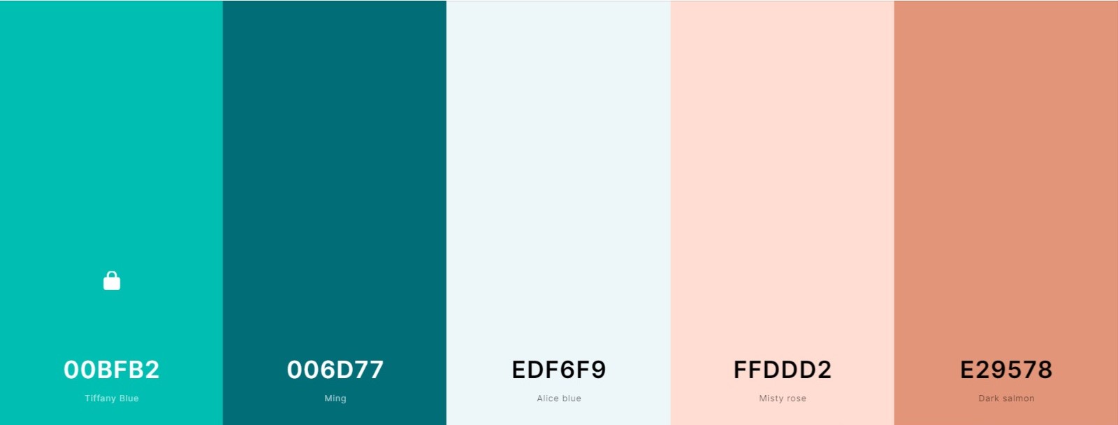
Colors
For our pages we have added an About page to inform visitors of our brand and of the team behind this brand. We have our team’s pictures on this page with roles we would take if this was an actual company. The News page was chosen due to the current pandemic. As we are a travel agency, we thought it is important to notify customers, we are currently not sending anyone on vacations. In the Mission section we specify our mission with this company. The Destinations pages are 6 separate pages for each destination. We will present the destination, show pictures of the destination and inform customers of the price of the trip. In the Contact page we have a contact form, as well as google maps with our address and links to our social media.
Fonts
We used two fonts throughout the website. The first one is ‘Dancing Script’ - the font we use on our logo. On the website it is applied only to titles. The other font, which is used as a main text font, is ‘Roboto’. It was chosen because it was a simple sans-serif font, which contrasts well with the cursive titles.
User testing report
During the interviews for Lean Canvas we did not have the website running yet, so we have decided to show the “users” wireframes, color scheme and flow diagram of our website and ask them questions from those.
*on the right is an image that we showed during the interviews
We have interviewed 20 potential users. The users liked our design and layout. We also gathered some recommendations on what to change. The most mentioned one was to add user reviews to the page, to show the potential customers what the satisfied customers think. Therefore we have added testimonials to the homepage. We were also told that it would be appreciated for the quiz to be on the main page, as it engages you with the company right away.
Later during the creation of the website we used our own team to look through each other's work and provide feedback on any issues we saw.